The View From Wisconsin
Just a random set of rants from a Sports Fan from Wisconsin.

Saturday, November 25, 2006
Deconstructing The Admirals New Logo (and Uniform)
It's been a few months now since the Admirals have unleashed their new uniforms on the public (and I'm still waiting for my customized jersey that I ordered). Now that we're past the knee-jerk reactions to the logo and uniform – most of them negative, of course – I figure it's time for a good long look at the combination, and do an honest critique of the whole ensemble.
First of all, there is an obvious method to the madness that is the logo change. The last time the Admirals changed ownership (when the Petits bought the team in the 1970's) was when the skatin' sailor design first came into being. When the logo was updated in 1998, it was a changing of the guard from the IHL independent team to the primary affiliate of the Predators. It wasn't surprising that the new ownership would want to put their own "stamp" on the team with a new logo.
Secondly, there's the color scheme. There is definitely nothing wrong with the black, white, grey and light blue color scheme. In fact, it's about time that the Admirals incorporated a water-like blue into their logo, and the use of grey brings out the image of a battleship. Black and white are basic as color schemes, but the other colors add to them.
Thirdly is the uniforms themselves. The design has a bit of a throwback to the 1980's, when teams like the Maple Leafs and Kings experimented with a solid stripe down the shoulders. The lettering and numbering have a "retro-modern" look to them; the font Techno (sadly, a Macintosh-only font) gives the uniforms that right combination of utility and elegance.
Unfortunately, that's where the problems start. It looks essentially like the team reversed the appropriate color schemes for the numbers on the shoulders and on the backs. The larger numbers should have been black with the light-blue outlines, which would have shown up on both the white and gray uniforms quite nicely. The smaller numbers should have been the light blue with either a white outline or a light gray outline. Anyone who has seen a game this year at the BC can tell you it's practically impossible to determine who's who when you're looking at them from the front.
The color scheme of the numbers make the vertical shoulder stripes look bad, unfortunately. You see the skeleton anchors on the shoulders, but not the numbers. In the long run, it's more important to know who's who on the ice instead of what team they're on. The only conclusion you can come to is that whoever decided on the black numbers with a light blue outline was not thinking.
And then there's the logo. No matter how hard they try to obfuscate and dodge and weave around it, the truth remains that it can be described in one word: pirates. They can foist the story of the "original logo" on the masses as much as they want – though it appears they've given this up, if a recent home game is any indication. When all is said and done, the logo looks like a skull with a sailor's cap, which to the casual observer looks like a pirate. The black and white colors of the uniforms just reinforce this notion.
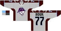
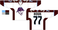
So, short of ditching the whole thing and starting over – which is unlikely, since logos need to be out for at least four years or so to make any sort of money – is there anything the team can do to improve on things? The first thing that comes to mind is making the most obvious change of all: the numbers on the shoulders. Get the company making them to switch to either blue or white swatches, and go from there. Next thing would be to do the reverse for the numbers on the back – make them all-black, or black with the light-blue trim.
Here's some examples of what I'm talking about:


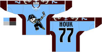
If the Admirals want to draw attention from the negative reaction to the skull logo, perhaps they should try putting the entire figure on a "third" jersey. Instead of grey or white, make it the light-blue color scheme, and put black numbering on the back with white numbers on the shoulders. That would not only make for a nicer jersey, it'd increase sales of team merchandise – since everyone would want one of these "alternates".
An example of this third jersey:

I don't think that Harris Turer and the rest of the new management group of the Admirals understand is that there was an attachment to the old "skatin' sailor" logo. It's somewhat ironic, since the team wears the old Brewers logo on their front shoulders – a logo that was around for about as long as the sailor, and was as popular among baseball fans as the sailor is to hockey fans in the area. Ideally, in a year or two, the Ads might toy with bringing the "adult" sailor back, using the same color scheme as today. It could be done and explained very nicely – the "meaner" look of the colors and of the haggard sailor.
